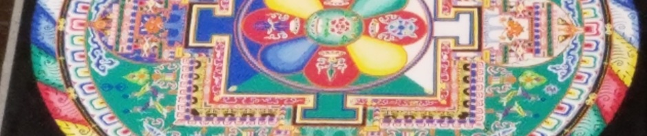
I went to visit the Virginia Holocaust Museum to witness the Tibetan Monks of the Drepung Loseling Monastery finish their mandala. The mandala is a spiritual and ritual symbol.
The result of four days of intense focus, placing vibrantly colored sand in ornate patterns. Each grain falls exactly where it needs to be for the effect. The picture builds out from the center. Each mon k working in concert. The table has basic guidelines but there is no telling what the final mandala will look like.
A book I have yet to read seems to be the latest fad in organizational transformation. Labeling organizations by Frederic Laloux’s palette of colors and an associated metaphor. Once you create an aspirational categorization, it can become a competition to immediately demonstrate your organization is at the target teal state. Some companies want to skip the journey altogether by buying and installing a framework .
In Agile transformations, growing in organizational capability is conflated with scaling in size. In a stunning act of consultant driven goal-displacement, an organization can divert from its purpose to make adopting the framework its goal. It loses its will to be in that state of creative tension that feeds change and succumbs to complying with the framework.
I submit that a color of organizations has been missed. I would like to add the Drunk Tank Pink Organization with its built in central metaphor. I’ve been reading Adam Alter’s book with the same title. The title comes from the effect first reported by Dr. Alexander Schauss, Ph.D. When cells were painted a certain color of pink he found it suppressed the violent behavior of prisoners.
“Drunk Tank Pink emerged as the unlikely solution to a host difficult puzzles, from aggression and hyperactivity to anxiety and competitive strategy”
Atler’s book is a comical compendium of the myriad ways in which our choices and thoughts are primed to be biased by phenomena inside, around and between us. Installing a framework is a challenge that should not be taken without the help of experienced coaches. There are many caring ones that will honor where an organization is starting from. However, like any large purchase, the seller’s needs to make a buck. I see a few of the mind tricks at work even if unintentional. I make these observations with tongue in check. Maybe they are just coincidence.
“The Birth of Nominative Determinism”
Names matter. In fact, the impact of names on outcomes has it own term, nominative determinism. There are many funny examples in the book like the decline of Donald as a first name in the thirties, after the arrival of Donald Duck. This might account for why modern Donalds seem so desperate to prove themselves by quacking louder than the next. How do the names of the scaling frameworks stack up?
DAD: Where the first D is for Discipline. It makes perfect sense as society’s authority figure brings the inevitable belt of change. Since 2015 it has switched to just Disciplined Agile. More straightforward but it would be interesting to see how the change correlated to mindshare.
LeSS: Short for Large-Scale Scrum. That should be LSS but that would sound like a snake. LeSS evokes a puritanical frugality that belies the cost of messy change. It also could suggest you are not getting as much for your money as other frameworks. How you take the name will likely be impacted by culture and so less predictable.
NEXUS: What flies in the face of distributed autonomy more than “the central and most important point or place”. Appealing to those who will have residual control issues.
SAFe: Hard to add much here. Why have that “e” when it is redundant other than to make the name prime one’s mind for feelings of calm contentment. The only other reason for it could be to avoid schoolboy chuckles arising when SAF is concatenated with the acronym for Agile Release Train.
ESP: If you are more the visionary type why not go with the acronym that aligns with that ego.
Winner: SAFe takes Gold, DAD takes silver, NEXUS and ESP tie for bronze.
“Labels Make a Complex World Simpler”
A framework’s overview diagram is the map of how things will hopefully look after the change agents have terraformed your organization. ESP would never have one by design. LeSS looks unassumingly childlike with lots of happy face icons playing games. DA looks like a confused European map of troop movements from a World War II documentary. Nexus looks like the Scrum diagrams but with sturdier lines.
SAFe, however, looks like a well-policed map with lots of boundaries and topological features. In fact, it conveniently benefits from the same misconceptions that people have because of the choice Ptolemy made during the time of the Ancient Greeks. Ancient maps had the well-known northern hemisphere placed on top of the less civilized southern lands, thus conflating a cardinal direction with a vertical direction. Atler quotes studies where participants equated going north with going uphill. My experience has been that people see the upper layers of SAFe as only being fit for the tough and worthy. South, where the teams live, is the easy way, in an ironic inversion of servant leadership.
Growing up in the “Land Downunder” I always found this odd. I’m a fan of McArthur’s Universal Corrective Projection which puts Australia on top. I think any scaled framework should similarly have the teams on top allowing their blockers to naturally roll downhill. When “things head south”, it’s in the direction of folks with the authority to do something about said things.
Winner: SAFe takes gold and the others fail to finish.
“Symbols Are Magnets for Meaning”
The book builds a case for how symbols influence us without our consent. The brain responds by triggering a cascade of hidden associations. Picking the right icon or metaphor could have an impact on how the buyer relates to the framework. How it inflates their self-image while subverting their choice.
DA: Lots of symbols on the DA overview. Those arrows going everywhere are overwhelming and give a sense of panic with no consistent direction. Remember, it is what the symbol triggers which blocks the reality of the model’s benefits.
ESP: Boxes with words, piled up and no metaphor. It reflects the emergent nature of service design but it does not invite engagement like a fence around the model’s ideas.
Nexus: Circles and boxes like the Scrum diagram but with a triangle thrown in for good measure. Generic and self-similar to the Scrum diagrams, which is the message understood by practitioners. The corporate buyer new to Agile sees nothing but another simple diagram.
LeSS: The icons and their cartoon style suggest light hearted fun. Much as I am a fan of play, I suspect the solemn selection ceremonies will not resonate with memories of small and fun Agile.
SAFe: Now we are talking. Lots of symbols to recognize. Boxes, packages, a columned house of lean triggering learned Greek philosophical thoughts, and people. Lots of people in teams suggesting community. So many people with all those new titles making the overview look like a job placement program for the PMO SAFe will replace. The eye, however, is drawn to the crown jewel of scaled agile symbols. The release train. It evokes, speed, power, purpose, and endless forward direction. It reinforces other metaphors of control like “being on track”.
Winner: SAFe pulls away from the station with the gold. Silver to LeSS. Bronze to an out of the shot DA.
Details in the Devil of Disfluency
As the buyer gets past the imagery of the overviews they will start to interpret the words. Alter introduces the notion of fluency and disfluency. A spectrum of the ease with which we can comprehend words. Short common words presented in easy to comprehend fonts become fluent messages. Ornate fonts or foreign words trigger deeper concentration but can also form a roadblock to understanding. Maybe even enough to deter the buyer from moving through to the content by creating a negative judgment based on no objective information.
ESP, Nexus, and SAFe use short straightforward fonts. SAFe avoids the foreign language of jargon that ESP suffers from. Nexus loves the word Nexus and the rest of the words are plain in the individual meaning. In the framework, they mean something different as in for example the word Scrum itself.
LeSS does not make the final round because of the font. It simulates handwriting suggesting notes on post-its but that little extra pain in the brain will likely bias the buyer.
DA is a clear loser. Different fonts including serif which are harder to read. The real killer is that the images on the site are lossy jpegs. The blurring is noticeable They should not matter but as the studies in the book show, the subconscious mind is under attack forming baseless opinions and adversely affecting the rational conscious decision.
Winner: SAFe and Nexus in a dead heat with SAFe winning by a nose.
Brown Organizations
How can an organization ever pick the right framework that will guarantee they become the best organizational color? Here’s an idea. Why not accept that the endless variety of organizational ecosystems cannot be lumped into a single category served by any framework. Why not accept that those ecosystems do not have a single aspiration to be the “perfect color”. They meander through a complex space adding and subtracting color as they go. Better yet why not accept that all organizations are always a mix.
I remember from my eXtreme Finger Painting days that when you mix enough colors they always produced brown. Rather than aligning with a singular metaphor why not let the color brown evoke a rich cornucopia of metaphors to go with its many shades.
Brown is the color of happy pigs in their filth enjoying its many medicinal and social benefits. I want to be in that organization of rich diversity to cure my ignorance.
Brown is the color of relief. Elephants taking dust baths to rid themselves of biting insects much like organizations roll around trying to rid themselves of self-inflicted pain points.
Brown is the color of forest soil. It anchors nature’s antifragile fractal forests of learning. Diverse yet interconnected in amazing invisible ways.
Brown is the color play. Of stained shirts and dresses, that symbolize the joy of being together.
Brown is the color of innovation. Of snatching at the tadpoles of opportunity, hoping a hopper will grow into a kissable green frog of success.
Brown is the color of culture. Of digging into the organizational dirt to plant the seeds and cultivate culture.
Brown is the color of mud, the metaphor for brown organizations. Almost as fluid as the water in Bruce Lee’s water metaphor yet containing the necessary grit to become a force in volume to bring about change. Change is as clear as mud. There is no right recipe for mud. You will only know if the mud is right for you when you become one with it.

Within an hour of completing the mandala, the monks performed the ritual of the closing ceremony. At the end of the ceremony, the mandala was dismantled. The act reflects the impermanence of 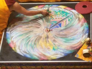 things. Any transformation is one of those things. Whatever level your organization attained, it will change. Maybe for the better. Maybe not. Any organization that stays fixated on staying fixed is a fragile thing at best waiting to be knocked over by the next wave of black swan events. Should all your hard work placing your grains be something to feel loss over? I don’t think so. It is not the color, importance or number of our grains we offer that matter. It’s the picture they helped form.
P.S. If a vibrant naturally emergent culture is not what you are after then Atler might suggest the following remodeling tips. First paint the walls Drunk Tank or Baker-Miller Pink – R:255, G:145, B:175. Next, post motivational posters consisting of large pairs of eyes. A study found it primed people to be more honest as they thought they were being watched. Police used it with some success on billboards. To complete that totalitarian vibe use blue lighting. It has the benefits of being calming, of helping people working into the wee hours adjust their sleep cycles while being primed to think that the blue represents police lights.
